
Ilfocolor Vintage Tone in Kyoto
I love shooting new film, and I don’t think there’s such a thing as “bad” film. Sure, there are some that are just “meh,” and a few that are straight-up weird. So when my friend handed me that roll, saying it was the worst film she’d used in a while, I took her second roll, confident that my magical photography nerd brain would work some kind of magic, and everything would turn out fine. Boy, was I wrong…


Let me introduce you to the Ilfocolor Vintage Tone by Ilford. But wait! Didn’t Ilford create Harman, a separate company, just to make color film since they’ve historically only done black and white? And this is obviously color, so what’s going on?
Well, here’s the deal: It’s important to note that Ilford Imaging Europe GmbH, which is responsible for this film, operates independently of HARMAN Technology. Ilford Imaging Europe focuses on color photographic products, but they still somehow retain the rights to the Ilford trademark.
Long story short, it’s a trademark mess, and these are two different companies.
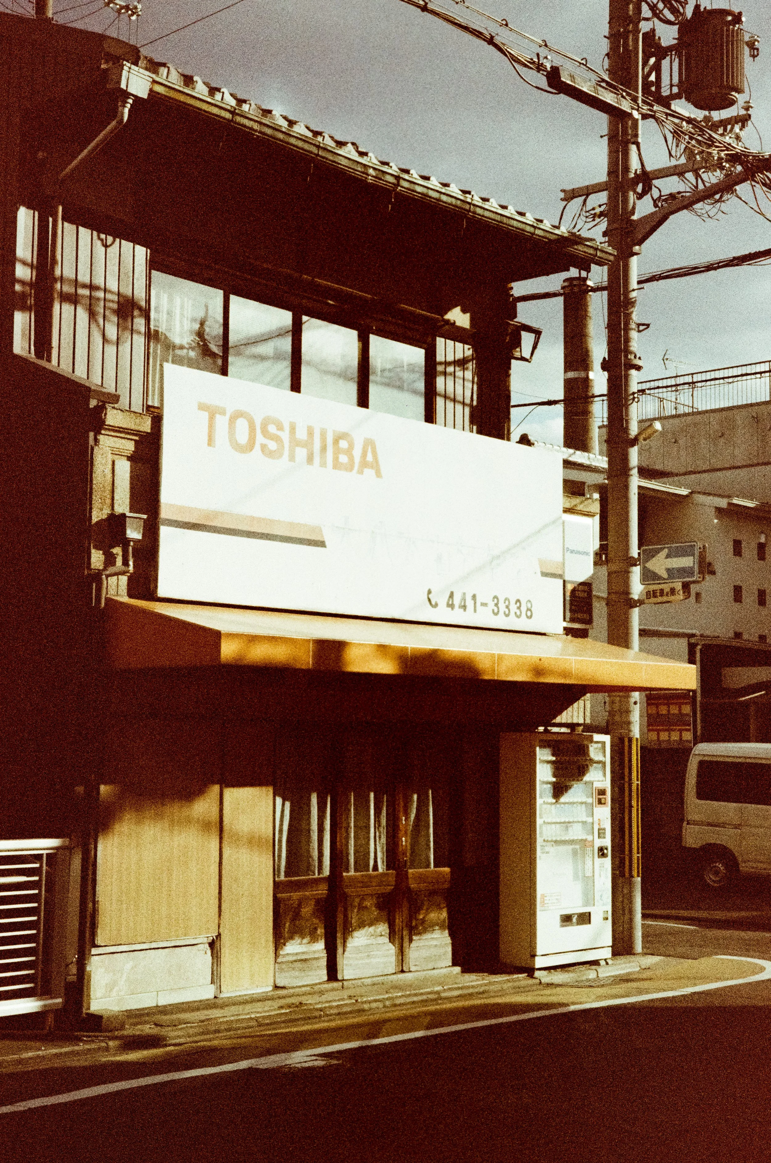
I shot this film with no prior research, and as you can clearly see from the brown tones, I’m not entirely sure what happened here. From everything I saw online, I was aware of the washed-out colors and the easily blown highlights, but I seem to be the only one with a brown tint this strong. I’m not complaining, I was just really surprised when I got the scans back.
To be honest, it does remind me of those old-school burnt Polaroids, so I’m sure some people will dig that look.
My opinion: grab a roll and shoot it like you would black and white film. Don’t overthink color theory or anything like that, because the result won’t match what you saw in the scene. Might use it again… We’ll see…
At least it was matching the bike pretty good.
🎞: Ilfocolor Vintage Tones 400
📷: Leica M6
📍: Kyoto